Git Datavis: The Power of Visualizing Your Git Repo
Often "senior+" work is about viewing a problem in a new way or bringing a new perspective to a deep-seated issue. The data in your git repository is a gold mine for analysis and sharing, especially for long-running software projects.
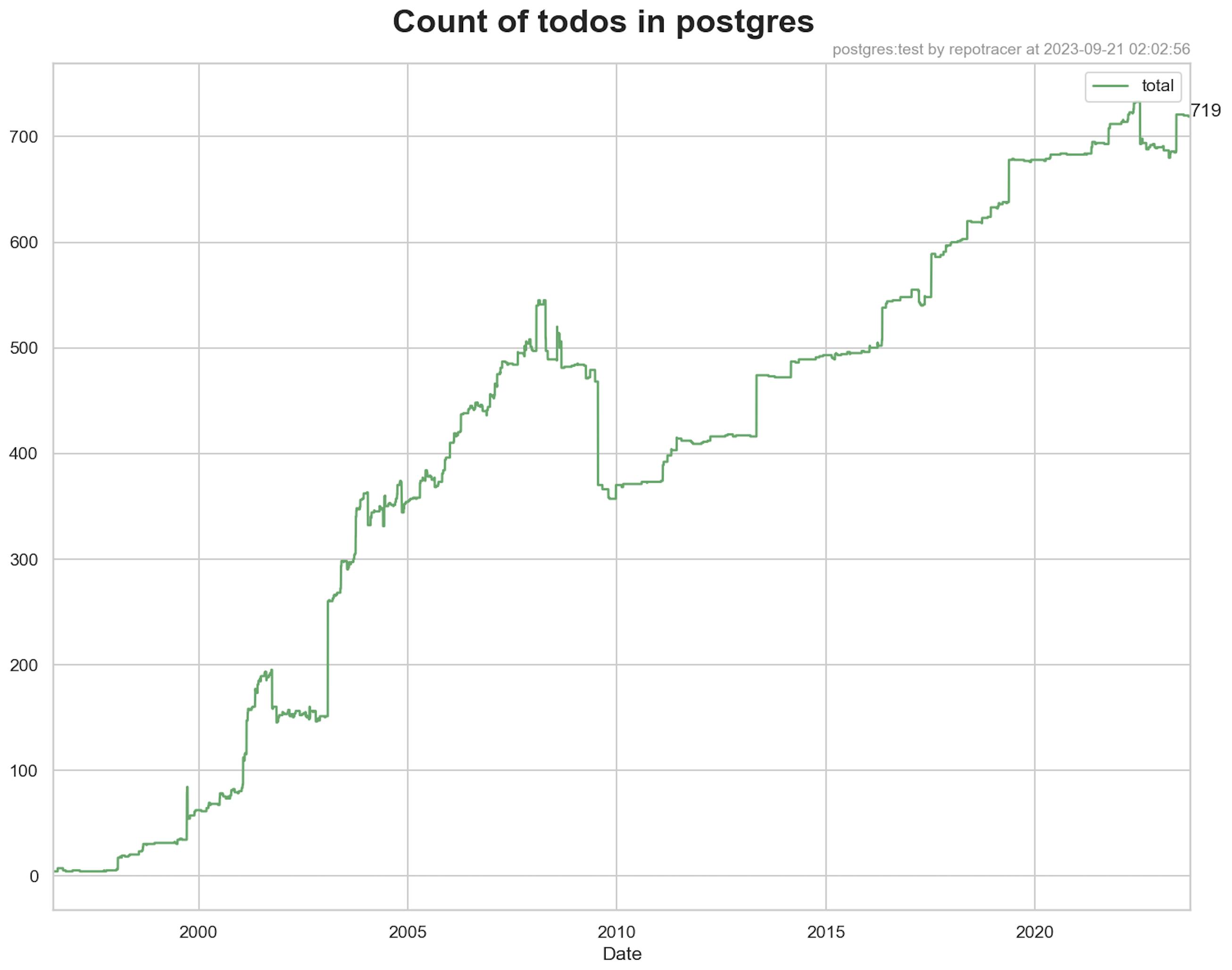
You can get really far by plotting daily counts of "bad patterns" in your repo over time, like calls to a deprecated function, components you need to refactor, or the number of files you have to migrate from JS to TS. Here's the number of "todos" in the postgres repo:

(I've done this so often that I'm building a small, not-yet-1.0 tool called repotracer to help with this.)
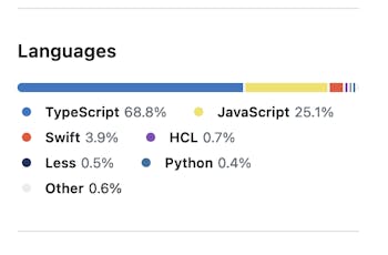
This is super useful when doing long-running migrations: A few years back my job started a push to migrate several hundred thousand lines of Javascript into Typescript. The plan was to do it slowly, over ~18 months in between other feature work. Our main progress indicator was the Github "programming languages breakdown" sidebar:

I was curious about the actual progress beyond the sidebar, so I wrote a small bash script to git checkout the last commit for every day in the last year, run tokei, and generate a csv for the TS/JS breakdown over time. The plot looked like this:

I showed the plot at a weekly meeting, and it was immediately clear to everyone that we were going too slow and would not reach the goal in our expected timeline. You could tell that we had covered ~12% in the last 6 months, so it would take ~3 more years to do the remaining ~75%. We decided to ramp up our investment in the migration, and in the end hit our goal.
The approach was really simple and had an outsized impact. These graphs stick indelibly in people's brains: they tell stories, get initiatives funded and people motivated.
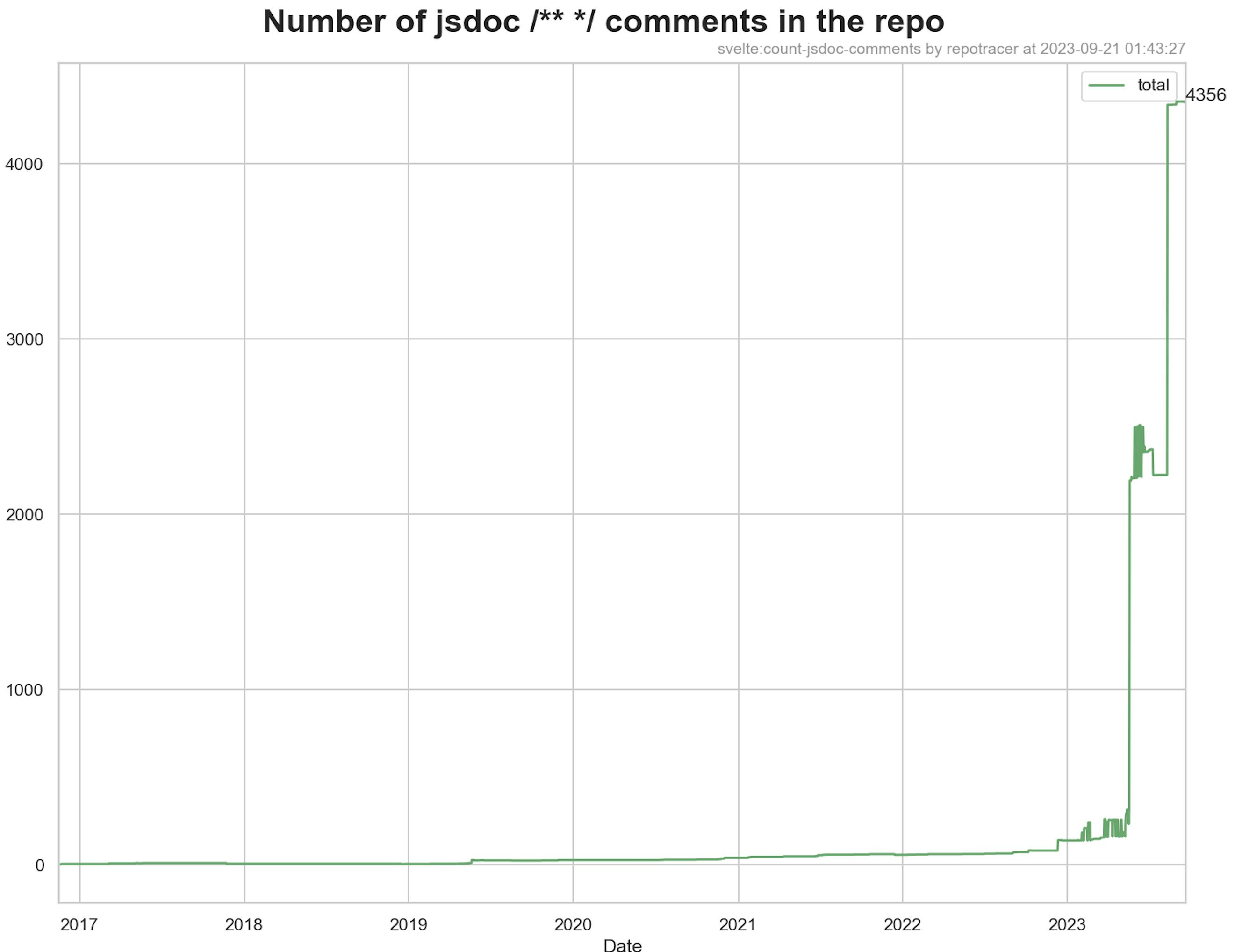
Random example: you might have heard that the Svelte project switched to jsdoc. But it hits different when you see it:

This holds even if the data collection approach is really simple and dumb: during an i18n project at work, we used a lint rule to prevent untagged strings from entering our frontend code, and grandfathered existing components by adding this to the top of every file:
// This file is not yet translated.
// eslint-ignore-no-raw-strings
I dusted off my git checkout script and had it count the number of This file is not yet translated strings with ripgrep:

It was extremely motivating to the team to see all our hard work on the page. The progress was much more visceral. It's one thing to say "We had about 1800 files to migrate 4 months ago, and now we have 1400, so we're doing about 100 a month", but it's 10x more motivating (and convincing?) to show the line plot of the project.
This also works well with "tools that hold the line" like betterer, which blocks CI/prevents merging new code that uses a deprecated code pattern, but lets you grandfather and keep track of existing allowed uses.
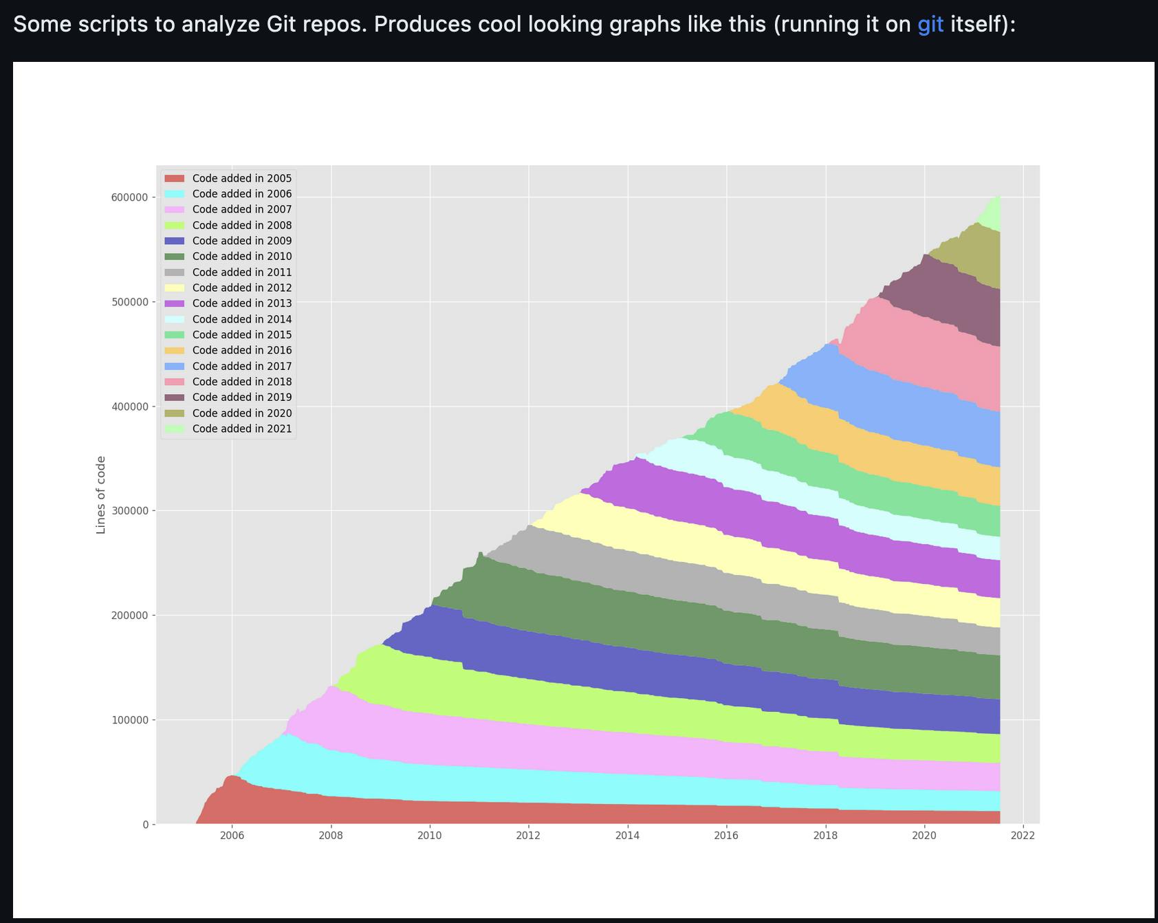
Another tool that visualizes git history is git-of-theseus. It makes beautiful plots of the "longevity" of each line of code:

I want more of these tools.
Software engineering "in the large" is all about industrial-scale migrations that can take years. These migrations are invisible to outsiders who never see your product malfunctioning (when the migration goes well). Plotting migrations is a great way to make that work visible and more tangible.
I started repotracer to do exactly this. It's still bare-bones, but it does one thing well: running a script on the git repo for every single day and plotting the output.
